The Downstairs Cloakroom That Got Tile Wallpaper Instead of Tiles
The cloakroom under the stairs had grey ceramic tiles to waist height and nothing above them, and the plan was to retile the whole wall. Tile wallpaper turned out to be the cheaper and quieter answer, and it went up in an afternoon instead of a weekend of grout. This is how the room looked before, what got decided, and what the owners would do differently.
Before
Five feet by four, no window, one extractor fan, and a ceiling light that made everything look flat. The lower half of the walls was grey ceramic in a running bond, the upper half was painted a dull off-white that had yellowed near the fan. The tiles themselves were sound. The problem was the top half: the room read as unfinished, and every visitor's eye went straight to the line where the tiles stopped.
Retiling to the ceiling was quoted as two days with the toilet out. That was the trigger for looking at a printed alternative for the upper section instead of matching the existing tile.
The decision that mattered most
Not the pattern. The question was whether to fight the existing tiles or ignore them. Matching grey for grey means the eye reads the joint between real tile and printed tile immediately, because the light behaves differently on a glazed surface. Ignoring them, by choosing something with a different scale and a warmer base, makes the lower band look deliberate.
They went the second way. The upper half got a small-scale geometric in ochre, teal and charcoal from the tile wallpaper range, which puts the pattern interest above the tiles rather than in competition with them.

Getting the moisture question straight
A cloakroom is not a shower room. There is no standing steam, so the practical worry is splash near the basin and condensation on the coldest wall. Two things settled it. The paper went on the two walls away from the basin, and the basin wall stayed painted with a wipeable finish. The fan was also on a timer that ran fifteen minutes after the light went off, which it had not been before.
If the room had a shower in it, the answer would have been different, and a printed design would have stayed out of the wet zone entirely.
Scale, in a room you can touch the walls of
In a space that small, a large repeat looks like a mistake: you only see two or three motifs, so the design has no rhythm. The tile they chose repeats roughly every six inches, which gives about eight motifs across the width and reads as a surface rather than as a picture. A terrazzo look wallpaper design would have worked for the same reason, since the fleck pattern has no obvious repeat to line up.

One thing they did right: they dry-laid the panels on the hall floor first and checked where the pattern would land at the corners. That took ten minutes and saved a cut through the middle of a motif at eye level.
After
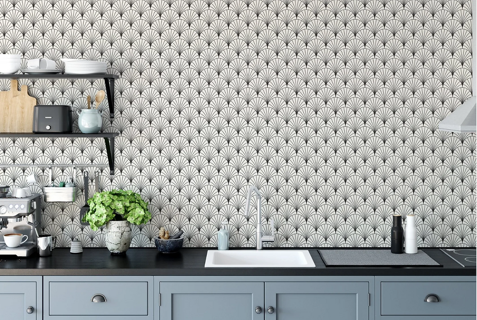
The line where the real tiles stop now reads as a dado rather than as an unfinished edge. The room feels taller, mostly because the pattern draws the eye up instead of stopping it halfway. The ochre also does something the paint never did, which is make the grey tiles look chosen rather than inherited. The design they settled on repeats in petal-shaped segments rather than a square grid, which hides a cut at the corner far better.

Installation took about three hours for two walls, including cutting round the cistern and the light switch. The paste-the-wall finish was the right pick for a plastered surface in a room that gets cold overnight.
What they would do differently
Three things. They would have ordered two samples rather than one, because the ochre looked stronger on the wall than on the screen and a second option would have made the choice quicker. They would have painted the basin wall before hanging anything, since masking a finished edge is fiddlier than painting first. And they would have replaced the ceiling light at the same time, because a small room with a pattern needs light coming from more than one point or the pattern flattens after dark.
The wider lesson is the one that applies to any printed stand-in for a hard material: it works when it stops pretending. The same argument comes up with plank effects, and there is a fair comparison of where a printed plank finish beats the real thing if you are weighing that up.
The one number worth writing down from this job is the dry-lay. Ten minutes on the hall floor with the panels laid out in order told them where the repeat would land at both corners and at the top of the tile line, and it moved their starting vertical about two inches to the left. Two inches is the difference between a motif cut cleanly between segments and a motif cut through its centre at eye height, which is the sort of detail nobody notices when it is right and everybody notices when it is wrong. Do the dry-lay even on a wall you think is simple, because a small room has more corners per square foot than a large one.
If you are starting from scratch rather than working around existing tile, the room-by-room notes at how to choose wallpaper for every room are a better place to begin than a pattern search.


Comments